
Why this chapter matters most to you
Course image created with generative AI using OpenAI tools, with direction and curation by the course instructor.
Your projector emits light. Not ink, not pigment. Every rule in the additive half of this chapter is a rule about the machine you are using, and the six-layer model is the most useful analytical tool in the book for looking at a surface and working out what is going on.
If you read one chapter of this book properly, read this one.
The habit you have to unlearn
Course image created with generative AI using OpenAI tools, with direction and curation by the course instructor.
We can distinguish roughly ten million colors, and we use almost none of that ability when we talk. As toddlers we learn to name an object's dominant color - the ball is red, the truck is green, the cloud is white - and we never really stop. We mentally repaint the world in flat, uniform colors, like a children's book.
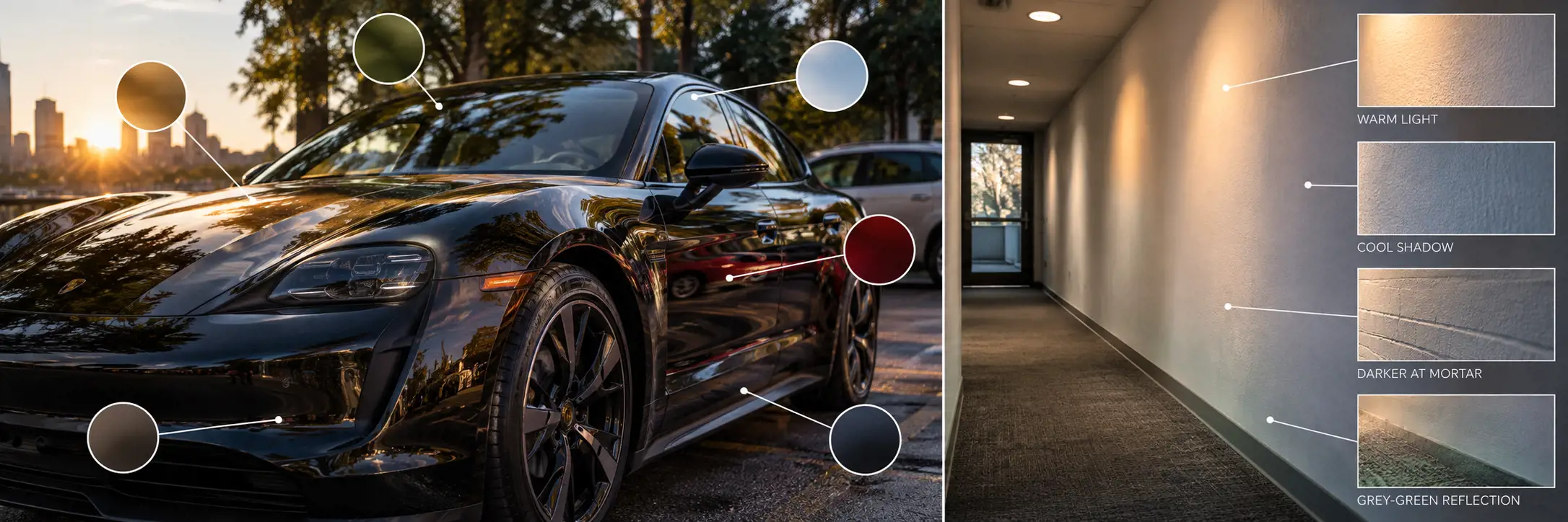
Dinur's example is a black car photographed on a sunny day. It is black only in a hypothetical sterile void. In the actual photograph its paint runs from red and green through to light blue and near-white. Sunlit panels go brighter and warmer, occluded areas go darker and slightly blue, reflected sky produces almost pure white highlights, and the trees and nearby cars throw their own colors into the gloss.
No car salesman describes "this charcoal-gray car with orange-white highlights and slightly bluish shadowed areas and desaturated green and red reflections". But that is exactly how you have to observe if you intend to recreate it. He is blunt that digital artists are more prone to this laziness than painters, because a painter has nothing but color to work with, while we have models and shaders and simulations and forget that it all resolves to color in the end.
The six-layer approach
Course image created with generative AI using OpenAI tools, with direction and curation by the course instructor.
This is Dinur's own framework, not a standard one. It splits the many factors producing a surface color into a hierarchy you can actually work through.
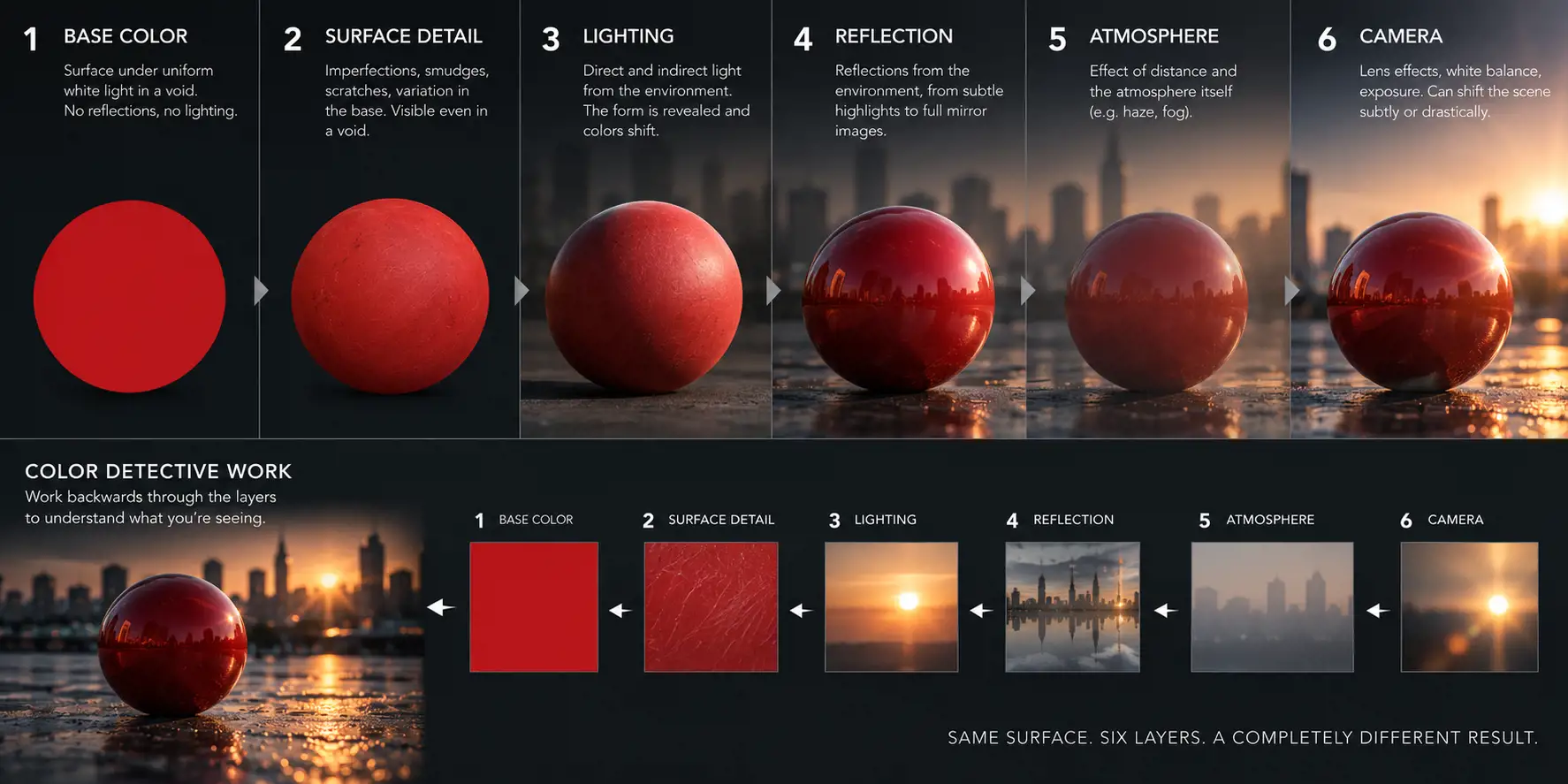
- Base color. The surface under perfectly uniform white light, in a void, with nothing to reflect and an unbiased camera. Impossible in reality; trivially easy in CG. A red ball is a flat red disc.
- Surface detail and imperfections. Smudges, scratches, variation in the base. Visible even in the hypothetical void, because they are not caused by lighting or reflection. The ball is still a flat disc, but no longer uniformly red.
- Lighting. Light sources plus the surrounding environment bouncing light back. Now the disc becomes a ball. Colors shift with the intensity, direction and hue of the light, and occlusion darkens the areas light cannot reach - the ground causes a noticeable darkening around the bottom of the ball.
- Reflection. Anything from isolated highlights of the brightest parts of the environment through to a full mirror image. Can contribute a lot of color variation.
- Atmosphere. Depends on the distance from camera and on the atmosphere itself - dry air does much less than fog.
- Camera. Lens flares, white balance, exposure. Can shift the whole scene subtly or drastically.
The real payoff is running it backwards. Step back down through the layers and you can reverse-engineer a photograph to its component colors, which tells you a great deal about the lighting, atmosphere and environment in the image. Dinur calls this color detective work, and says it is an essential step before integrating anything into existing footage or emulating a lighting scenario.
He also notes the layers map neatly onto a production pipeline: modeling is layer 1, texturing layer 2, lighting layer 3, shading layer 4, depth and atmosphere layer 5, lens and camera effects layer 6.
Subtractive and additive
Subtractive - paint and ink
Course image created with generative AI using OpenAI tools, with direction and curation by the course instructor.
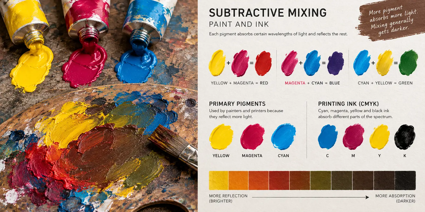
Mixing paint mixes reflected light, not emitted light. Each pigment defines what gets absorbed and what gets reflected. Green paint absorbs most of the red and blue; red paint absorbs green and blue. Mix them and the combined pigments absorb more of the spectrum and reflect less, so you get a darker brown.
Because subtractive mixing runs progressively darker, painters generally start from secondary colors - yellow, magenta, cyan - which reflect more than they absorb, and rely on white pigment to lighten. Mixing two secondaries reduces the reflection to a single pure primary. Printers use the same logic: cyan, magenta and yellow, plus black ink, which is CMYK.
Additive - screens and projectors
Course image created with generative AI using OpenAI tools, with direction and curation by the course instructor.
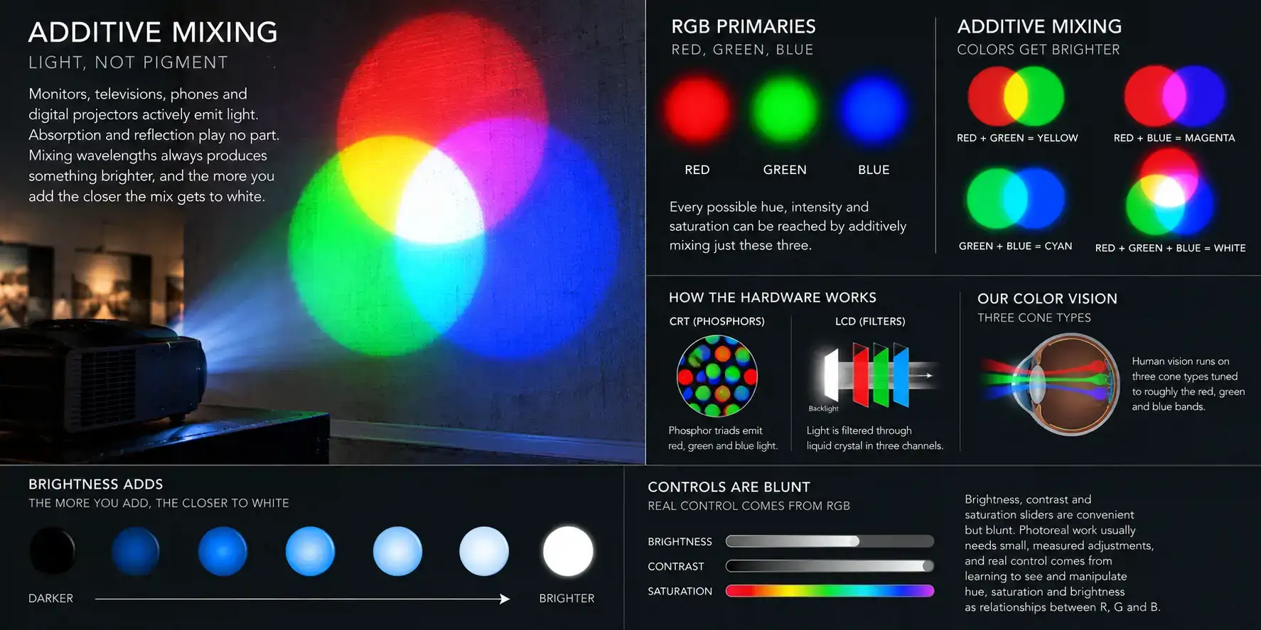
Monitors, televisions, phones and digital projectors actively emit light. Absorption and reflection play no part. Mixing wavelengths always produces something brighter, and the more you add the closer the mix gets to white.
The primaries are red, green and blue, because every possible hue, intensity and saturation can be reached by additively mixing just those three - and because that is how the hardware works. A CRT used phosphor triads; an LCD filters light through liquid crystal in the same three channels. Our own color vision runs on three cone types tuned to roughly those bands.
Dinur's practical argument: brightness, contrast and saturation sliders are convenient but blunt. Photoreal work usually needs small, measured adjustments, and real control comes from learning to see and manipulate hue, saturation and brightness as relationships between R, G and B.
Hue, saturation and brightness, in RGB terms
Course image created with generative AI using OpenAI tools, with direction and curation by the course instructor.
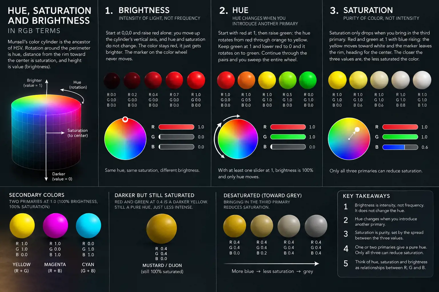
He runs the whole model on three sliders, each from 0 to 1. Munsell's early-20th-century color cylinder is the ancestor of HSV: rotation around the perimeter is hue, distance from the rim toward the center is saturation, and height is value.
Brightness
Intensity of light, not frequency. Start at 0,0,0 and raise red alone: you move up the cylinder's vertical axis, and hue and saturation do not change at all. Pull it back down and red gets darker as the light gets weaker. The marker on the color wheel never moves.
This is the source of a common mistake - calling different intensities "different hues". Say "a darker shade of red", not "a more greenish red hue", and the distinction stays clear.
Hue
Hue changes only when you introduce another primary. Red at 1, then raise green: the hue rotates from red through orange to yellow. Keep green at 1 and lower red from 1 to 0 and it rotates on from yellow to green. Continue through the pairs and you sweep the entire wheel. Whenever two sliders are at 1 the result is a secondary - yellow, cyan or magenta.
While at least one slider sits at 1, brightness is still 100% and only hue moves. Drop both below 1 and you start reducing brightness: red and green together at 0.4 is a much darker yellow. Designers will call that mustard or Dijon. It is still pure yellow, just less intense.
Saturation
This is the one people get wrong. All the shades above are 100% saturated, however dark they look. Darker shades feel more subdued, so we tend to read them as less saturated - but saturation is purity of color, how far it sits from neutral gray, and it is a separate axis from intensity.
Saturation only drops when you bring in the third primary. Red and green at 1 with blue rising: the yellow moves toward white and the marker leaves the rim, heading for the center. Red and green at 0.4 with blue rising: it moves toward gray. The rule is that saturation is set by the spread between the three values. The closer together they are, the less saturated the color. One or two primaries always give a pure hue; only all three can reduce purity.
The five color operations
Course image created with generative AI using OpenAI tools, with direction and curation by the course instructor.
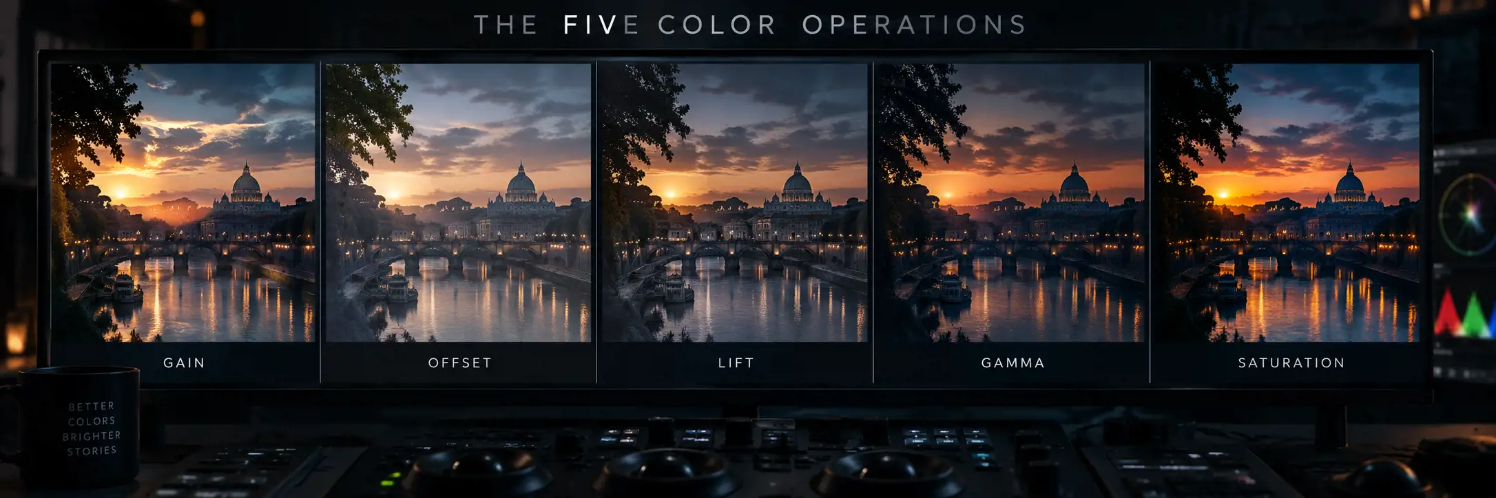
Terminology across applications is a mess - the same operation appears under different names, and some applications offer several controls that do the same thing. Dinur narrows it to five. All five control brightness; they differ in which part of the range they affect, which is what makes each one right for a particular job.
He deliberately excludes contrast, because contrast is a relationship between dark and bright values across an image and cannot be assigned to a single pixel. It is produced by combining the operations below.
Gain (exposure)
A multiplier. Gain of 2 doubles every value; 0.5 halves it. Zero always stays zero, so the curve pivots at the black point, which means bright tones move far more than dark ones. At gain 3, a value of 0.001 becomes 0.003 - still essentially black - while 0.33 goes to 0.99, nearly white.
That relative preservation of the low end is exactly what our vision expects, which makes gain the best tool for overall brightness: the image gets brighter without washing out. It is also the right operation for shifting hue, since it changes the relative brightness of the RGB channels.
Some applications call it brightness, which is inaccurate. Some call it exposure, which is correct - exposure is the same multiplier expressed in stops. Raising exposure three stops equals gain 8; lowering four stops equals gain 0.0625.
Offset
Additive. Offset of 0.2 raises every value by 0.2, equally, including zero. Because our perception of brightness is biased, this does not look even: the blacks lift first and drag the midtones and highlights along until the whole image goes white. Poor for overall brightness, useful for controlling saturation manually.
Lift
output = input * (1 - lift) + lift. The lower the input value, the bigger the change. At lift 0.2, a value of 0.01 jumps to 0.208 while 0.95 barely moves to 0.96. The curve pivots at 1 - a mirror image of gain. That makes lift the right tool for adjusting the low end without touching the highlights, and since accurate blacks are critical for integration, it earns its place.
Gamma
Non-linear: output = input to the power of 1/gamma. At gamma 2.2, a value of 0.1 becomes 0.35 while 0.9 becomes 0.95. The curve is anchored at both 0 and 1, so pure black and pure white never move, and the effect bellies out through the low and low-mid range.
Raising gamma lifts the low and mid tones toward the highlights, reducing the difference between dark and bright - so it reduces contrast without flashing the blacks the way lift or offset would. Lowering gamma darkens the low end while preserving the top, increasing contrast. Combine gamma with gain and you can control contrast precisely while holding overall luminance, and because gamma can be applied per channel you get fine control over color as well.
Saturation
Doing it by hand is awkward. Take a fully saturated yellow at R=1, G=0.9, B=0. To desaturate you must raise blue toward the other two - and gain and gamma cannot do it, because neither affects a zero value. Offset can, but adding that much blue light also makes the color substantially brighter than it started. A saturation tool exists to handle that balancing act, holding luminance and the relationships between primaries while changing purity.
His caution: saturation is a blunt instrument. Increasing overall saturation in a landscape mostly amplifies whichever hue already dominates - usually green - rather than the sunset warmth and sky blue you were actually after. Often the fix is not global saturation at all but a gain reduction on one dominant hue, which changes intensity rather than hue. Usually one or two hues are the problem, not the whole image.
Bit depth and dynamic range
Course image created with generative AI using OpenAI tools, with direction and curation by the course instructor.
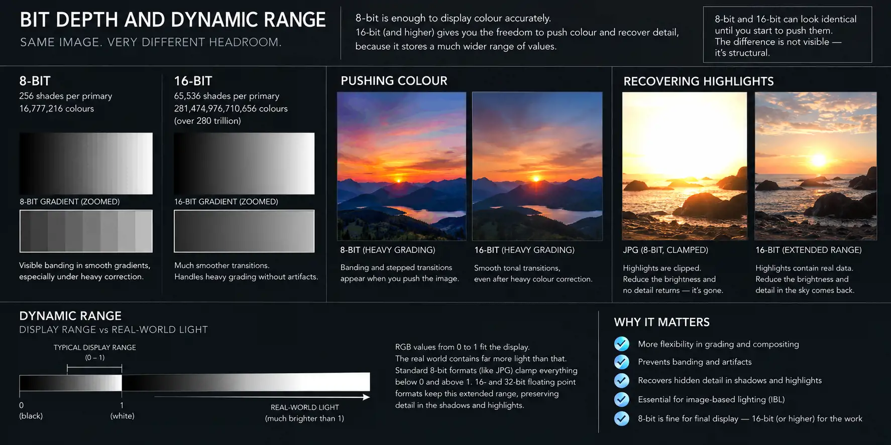
8-bit gives 256 shades per primary and 16,777,216 permutations - more than enough to display color accurately, since we perceive around ten million. 16-bit gives 65,536 per primary, over 280 trillion combinations, which sounds absurd.
The difference is not visible; it is structural. 8-bit and 16-bit versions of an image can look identical and behave completely differently the moment you start pushing color. An 8-bit image shows banding, stepped transitions and artifacts under heavy correction, especially in areas of fine gradation. 16-bit is superior not because it looks better but because it is far more flexible.
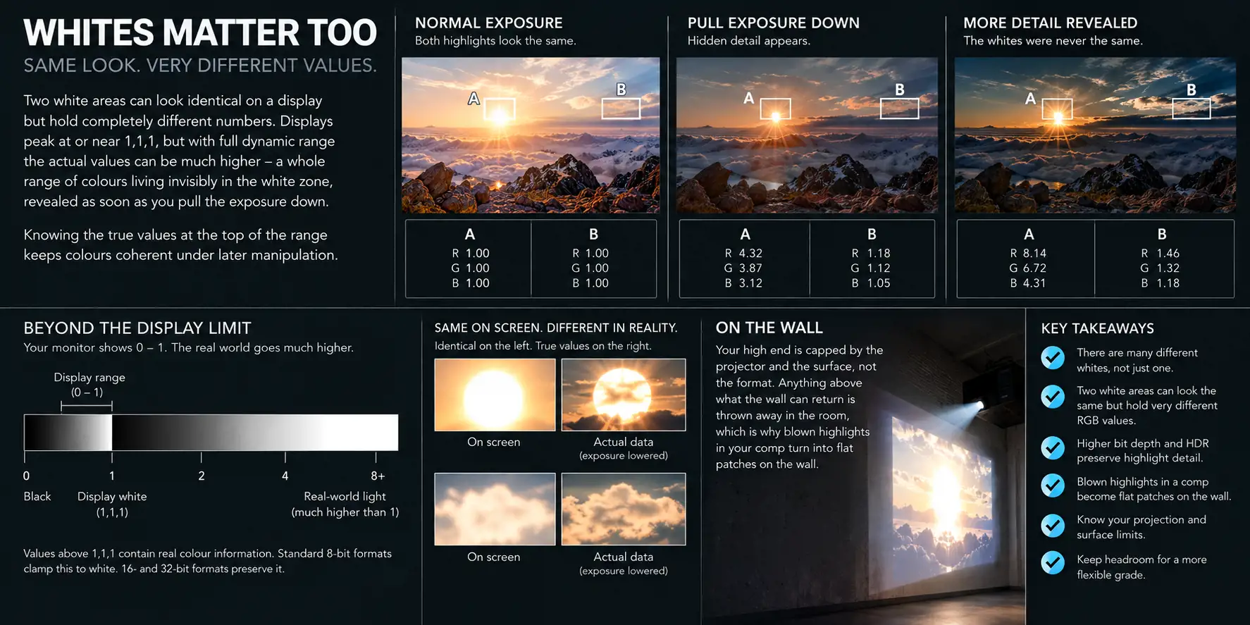
The second half of this matters more. RGB 1,1,1 is pure white on a display, but the real world contains far more light than that. Formats like JPG clamp everything below 0 and above 1, so that information is simply gone. 16- and 32-bit floating-point formats keep an extended range, preserving detail hidden in the blacks and whites - detail that was not visible at the original exposure but reappears once you change it.
Reduce the brightness of an overexposed sky in a JPG and no detail returns; it was clamped and destroyed. Do the same in a 16-bit file and it comes back. High dynamic range is also what makes image-based lighting work, because a photographed light source keeps its true luminance.
The low end
Course image created with generative AI using OpenAI tools, with direction and curation by the course instructor.
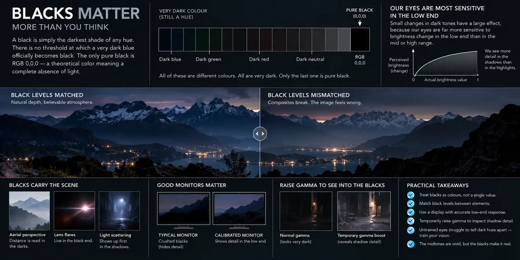
Blacks, plural. Not singular. A black is simply the darkest shade of any hue, and there is no threshold at which a very dark blue officially becomes black. The only pure black is RGB 0,0,0, which is a theoretical color meaning a complete absence of light.
Small changes down there have a large effect, because our eyes are far more sensitive to brightness change in the low end than in the mid or high range. Aerial perspective, lens flares and light scattering are all most noticeable in the blacks. A mismatch of black levels between elements will destroy a composite or a matte painting, and inconsistent black levels in a texture map will ruin an otherwise photoreal render.
Dinur calls this a paradox: we take crucial distance and depth cues from blacks almost subconsciously and can immediately sense that something is wrong, yet in daily life we pay them almost no attention, because the midtones are where the vivid hues live. Untrained eyes struggle to tell dark hues apart. Developing that sensitivity is part of the job.
Two practical notes. Hardware matters - most monitors, including good ones, fail at the very low end, so texturing, lighting, matte painting and compositing need a display with accurate black representation. And since it is hard to see into the blacks even on a good monitor, temporarily raising the display gamma is standard practice; several applications have viewer gamma and gain controls for exactly this, and if yours does not you can add a temporary gamma correction.
The high end
Course image created with generative AI using OpenAI tools, with direction and curation by the course instructor.
Whites, plural, too. Displays peak at or near 1,1,1, but with full dynamic range the actual values can be very much higher. Two white areas can look identical on a monitor and hold completely different numbers - a whole range of colors living invisibly in the white zone, revealed as soon as you pull the exposure down. Knowing the true values at the top of the range keeps colors coherent under later manipulation.
Terms from this chapter
- Six-layer approach - Dinur's model for analyzing surface color: base, detail, lighting, reflection, atmosphere, camera.
- Subtractive color - mixing reflected light. Pigments and inks. Mixes toward black.
- Additive color - mixing emitted light. Screens and projectors. Mixes toward white.
- Hue / saturation / brightness - position on the wheel, purity of color, intensity of light. Three independent axes.
- Gain, offset, lift, gamma, saturation - the five basic color operations.
- Clamping - discarding values below 0 and above 1, as 8-bit formats do.
- Dynamic range - the span of light intensities a format can hold.
Check yourself
- Name the six layers in order, and say what each one adds to a red ball.
- Why does mixing all three primaries of light give white, and all three primaries of paint give mud?
- Which slider movements change hue but not brightness? Which change brightness but not hue?
- Why is a dark mustard yellow still fully saturated?
- Which operation would you use to brighten an image without washing it out, and why not offset?
- What does an 8-bit file lose that a 16-bit file keeps, and when do you find out?
- What sets the black point of your projected image, and what does that do to your color decisions?